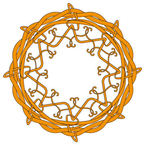
 I am still in the process of developing my knotwork skills. Mainly I feel that my stuff has been too mechanical up until now and I am trying to bring more of an organic feel to it. This isn’t the easiest thing to do considering that I create the art with a vector drawing program, but I can see some signs of it starting to loosen up finally. I just drew a simple framing device this week. My ultimate goal is to do more figurative stuff like people and dragons but for now I am focusing on building the basic skills.
Tag: art
Ultraman
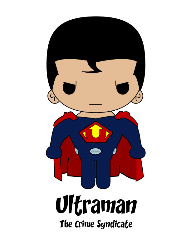 This week my super Saturday kawaii offering is Ultraman. Not the hero of Japanese TV and manga fame (although I loved watching those shows as a kid) but the DC villain from Earth 2’s Crime Syndicate. Briefly, the Crime Syndicate was an evil version of the Justice League from another dimension and Ultraman was their version of Superman. There have been a number of costumes for this guy over the years but my hands down favorite has to be the one by Frank Quitely. It captures the elements of classic Superman’s costume but strips out all of the unnecessary detail. The kicker for me is the U logo. Other artists have used a stylized letter U or replaced the S with a U in Superman’s normal logo. Quitely flipped the pentagon shape and stylized the U to the extent that it also works visually as an arrow. Flipping the pentagon is a nice visual representation that this guy stands for the opposite of everything Superman supports. Pushing the letterform into a stylized version that serves double duty is just icing on the cake for me.
A Norseman in Love
Valentine’s Day is only a week away and I used that as my inspiration for this week’s Norse-themed artwork. I started off by searching the net for any links between Valentine’s Day and the Norse. As with most things on the net, I found stuff out there but I’m not sure how much of it I can trust. There are pages saying the holiday is actually named after a Norse saint named Galantin and the G is pronounced like a V. Other pages say the name is a corruption of Vali, Odin’s son who was an archer god (shades of Cupid?) The best part, and I am using the word ironically, is that these pages hardly ever back up their assertions with references.
However I did come across this page which talks about a 12th century weaving tool that had the following runic inscription carved onto it:
Think of me, I think of you. Love me, I love you.
Isn’t that sweet? The piece was found at the Bryggen site in Norway and you can see a little more information about it here.
This was the perfect springboard for me and helped me decide that this week’s art should be something a little more useful than what I normally do. So I put together the below graphic. Save the graphic to your computer. Print it out on a sheet of stiff 8.5×11 paper and then simply fold it in half and you have your very own Norse-ish Valentine card to share with someone you love. I went with a black and white graphic so you can color it yourself or just leave it plain. (I know the knot-work is a bit more Celtic than Norse. I’m still working on developing more of that free-form feel of the Norse knot-work into my art.)
I hope you all enjoy this.

Nine Worlds Travel – Muspellsheim
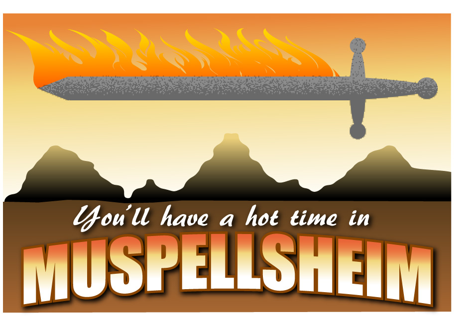 Hey folks, this week’s retro travel poster/Norse myth mashup* brings us to Muspellsheim. Although I don’t think you would have much of a tourist industry in a land that is “too luminous and glowing for foreigners to enter there.” That’s what the Eddas say about the place. Basically if you weren’t born there or part fire-demon, you can’t stand the heat – even if it is a dry heat.
Nine Worlds Travel – Niflheim
 While considering what kind of Norse-inspired art to do this week, I thought it would be fun to do some vintage-looking travel posters for each of the Nine Worlds of Norse mythology. Since I just posted some fast facts about Niflheim the other day I decided to start out with the land of primordial cold. I found a number of cool posters online for the different Nordic countries to give me some inspiration and dove into the piece.
That retro look I was going for uses big bold shapes and fairly simple outlines so I fired up Illustrator and got right to it. I was really happy with the results. It was bold, it had a nice icy palette, my mountains and snowscape were nice and crisp and bleak. I added Hela, rocking a dark green dress. All it needed was the text. I found a cool font and typed out Niflheim – Abode of Mists. That’s when it hit me – I didn’t have any mist at all in my picture! Niflheim translates as home of mists or misty lands and I had created this crisp, clear landscape.
Not a major problem because in addition to Illustrator I have Photoshop. We’ll just slide the artwork over there and add some nice mist. And it was easy, but then I decided I needed a little texture for the snowfield. Again, not that hard. So I decided I needed a little texture for the mountains. Then the text needed some fixing. Then… Photoshop locked up! Something is wiggy with the text engine and it crashes every time I try to do anything. I’m running an older version that isn’t supported anymore and it has always been a bit rough on Win7. Hopefully I’ll be able to work past this little hiccup later on. For now I went back into Illustrator and added some not-quite-as-good mist effects. So after considerable rambling, we have this week’s Norse inspired art and will hopefully have an enhanced version of it sometime soon.
A Knotty Question
 Can any of you pass along some good references for Norse knot-work? I have a great book on drawing Celtic style knot-work but was wondering if there are any good instructional books for the Norse version. I suspect they might be more popular in the Scandinavian countries. My local librarian did help turn me on to THE INDUSTRIAL ARTS OF SCANDINAVIA in the Pagan Time by Hans Hildebrand. I’ve only leafed through it so far but it looks promising. However, I’d love to see more.
Thanks!
Valkyrie Art
 Hey, it’s Thursday so it’s time to post some Norse-themed art. Once again, this is in a different style from some of the stuff I have posted before. I can’t help it. Like Whitman said “I contain multitudes.” Except in my case it appears to be multitudes of artists who can’t decide on one way to draw things.
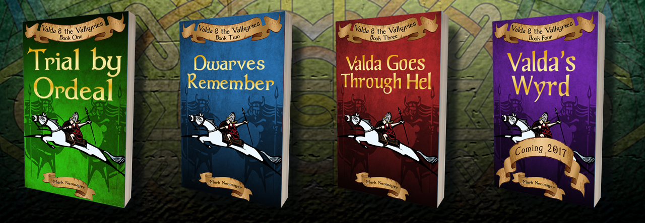
This stylized valkyrie was part of the background on the original cover for my book Valda & the Valkyries. I decided to polish her up and give her the spotlight treatment today.
Lucky 13
 Another little deviation from our regular programming, but I wanted to post something for my wife since today is our 13th anniversary. We were both big fans of the Rome mini-series on HBO and I couldn’t resist a little echo of the scene from the arena where Pullo was shouting 13. Yes, I know the picture is not of a bloody gladiator. I probably could kawaii up a gladiator but I prefer to celebrate my anniversaries in a less violent way. So just a little salute to the Cleopatra to my Marc Anthony – my wife Theresa.
The Heart is Bold that Looks on Gold
 I’ve been posting kawaii artwork on Thursdays and I intend to keep on doing that. There is a problem with this week’s artwork – I don’t like it. I’m working on the kawaii version of Sleipnir but so far I haven’t been able to come up with anything I feel is good enough. (Those eight legs keep getting in the way of each other.) But I still wanted to post some kind of art so I did this piece.
I love the artistic style that Games Workshop uses for the Dwarves in their Warhammer game. It’s kind of weird because although I have read a lot of issues of White Dwarf magazine and pored over websites about the hobby I’ve never actually played the game.
The Dwarves in the game are very attached to their ancestors and frequently decorate weapons and armor with these little iconic representations of them. The GW artists have done a great job of invoking the look of the various carved images that we find on stones and wooden relics from the Norse countries. I did this piece to represent one of these icons before it is attached to a piece of armor.
I’m happy with the art although I do think the lines are too precise. This is a side effect of me creating the base in a vector drawing program. I’ve create my original lines and shapes in Adobe Illustrator and then bring it on over to Photoshop where I add textures and effects. I’ve been using both programs for over fifteen years so it is often easier for me to do something in the program than it is using paper and pencil. The knotwork is so much easier in the digital realm – you got to love that Undo button! If you’re interested in the process I use to create digital knotwork you can check out a tutorial I did. The tute is a few years old but all of the same principles still apply.
BTW, the line in the title comes from JRR Tolkien’s The Hobbit.
Posted by Mark NeumayerFeeling A Little Kawaii
 I spend most of my time writing now, but I worked as a graphic designer for a long while. Plus, I’ve always been a doodling type of guy. So when I had the chance to buy Christopher Hart’s Manga for the Beginner: Kawaii I jumped at it. Very cool book with some great tips for the artist wanting to draw in the super-cute Japanese style. (Hey, I like Mixed Martial Arts and kawaii manga – I’m complex.)
Here’s the first piece I drew after getting fired up from reading the book. I worked up a kawaii version of the main character from my book Valda & the Valkyries. Sketched by hand, then scanned and built in Adobe Illustrator. I’m happy with it but I think we need a version with Valda having those Viking-style braids.
